I collected millions of business cards from the New Designer show in London in an attempt to see what was clearest to read, what information details were given and how they were presented in a way that is appealing and catches the eye; my eye :) Just a bit of research which will hopefully help me when I
come to design my own.
These were my favourites and why:
|
For some reason the large line breaks work really well. Isolating that bit of text makes it jump out at you. I like the continuity in the font which is probably an obvious thing to do. The only thing that I don't like is the name she has chosen to represent her work and the way its written. Its too cutesy and reminds me of secondary school and all the young girls putting hearts over their i's. It makes her card look less professional and I don't think it is suited to the bold brilliant geometric feel to her work. Needs to be more edgy but having a signature typeface is a good idea :)
|
 |
| Bright and eye-catching. Shiny gloss finish makes it look professional and its waterproof :) I like the way she has numerous sections of her print work. They all work together in colour scheme but she's showcasing as a collection so we get to see more of her work. More of her work that can catch our eye as having potential! |
 |
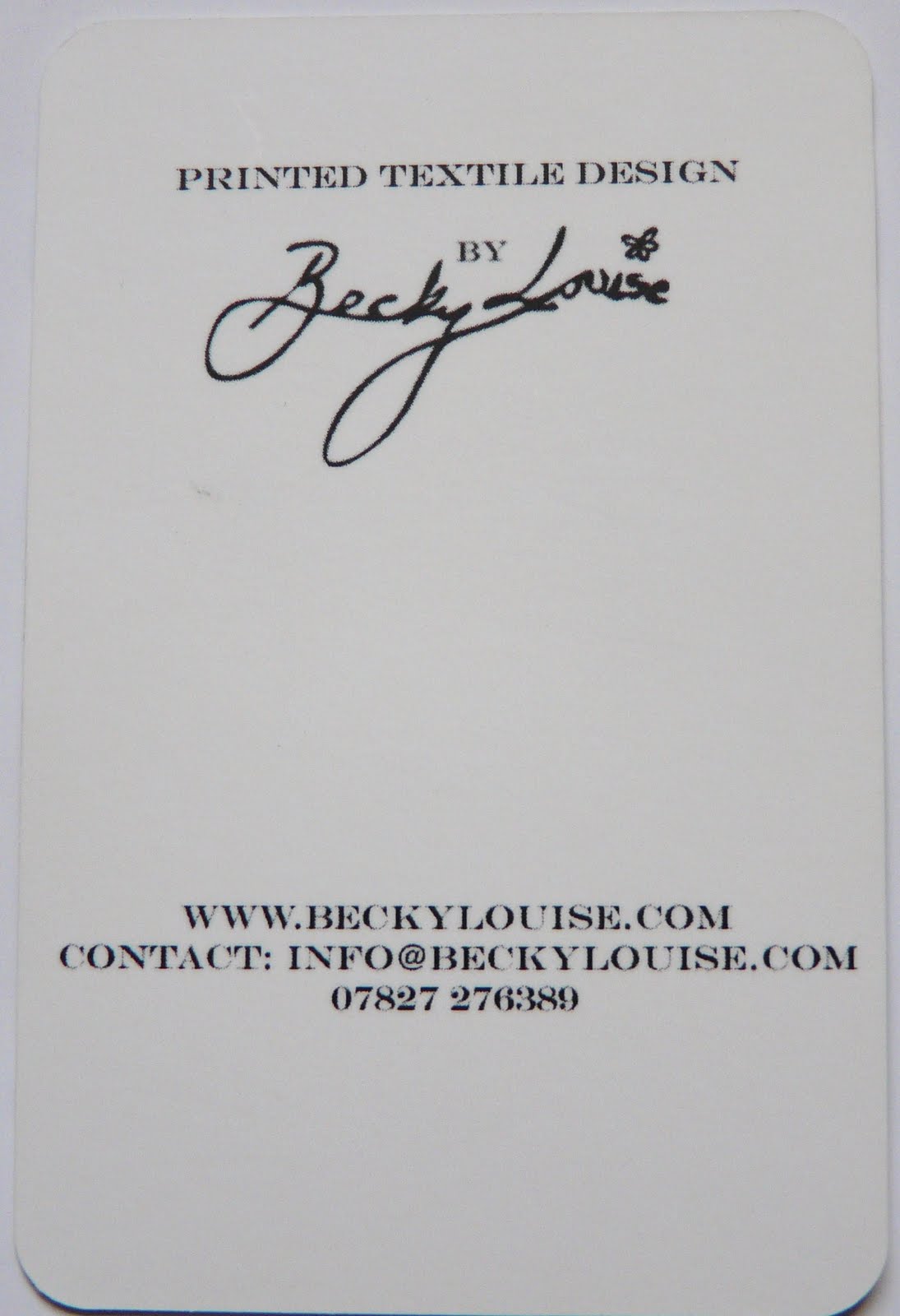
| Simple back. Very clear and using typewriter type which gives it a handmade personal feel as well as looking professional. All the text is of the same size though, I think her name should stand out more. Bigger or bolder or on the front. |
 |
| Simple and clear and to the point. The line break DOES help make her name and profession stand out from the rest of the text. I like the category letters she uses as bulletpoints for her contact details because its much easier to read. Very small business card. Easily lost :( Her work is so abstract and edgy maybe she could have worked in her imagery to make the card more exciting. Use both sides. |
 |
| Add caption |
 |
| Add caption |
 |
| Add caption |
 |
| Add caption |
 |
| Add caption |
 |
| Add caption |
 |
| Add caption |
 |
| kjhtdgsd |
 |
| Add caption |
 |
| Add caption |
 |
| Add caption |
 |
| Add caption |
 |
| Add caption |
 |
| Add caption |


No comments:
Post a Comment